Glossier Inc.

Founded in 2010, Glossier, Inc. provides online beauty products. The Company offers skin care, makeup, hair, and bodycare products. Glossier serves customers worldwide with 408 employees and is valued at 1.8 Billion.
In 2019 Glossier had a pop-up in Austin, TX where they first introduced 3 of their in house
designed G-Pal characters. The G-Pals were received well in Austin and the company decided to use them for Holiday 2020.
When Glossier approached me they expressed that
they experienced some difficulty designing them.
Glossier wanted a redesign of these 3 G-Pals, and
for me to create 7 additional characters for their
Holiday 2020 global campaign. Several scenes with
these characters in action were also illustrated.


Client's initial in-house design

Redesigns:
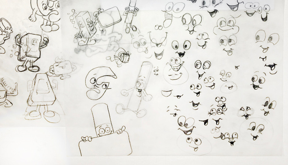
Our main brand mascot G-Man, modeled after the brand's letter mark logo got his first changes by me with his eyes. I added more space to the whites of his eyes for a cuter look as the client was seeking. His smile is a type I use for characters that evoke a sense of youth and helps with introduction. The smile and other features were designed to flow with the letter mark more so than their original version. His hands were plumped to evoke cute. The shoes more rounded to look softer.
Through several rounds I shortened limbs for added cuteness. I removed noses focusing on a sweet and somewhat universal facial quality to all the characters. Extremities were shrunken down.
All these choices helped bring the focus on the very product the characters were made of.
With the beauty products being the primary focus for me, the personalization helped them come to life and increase familiarity with the consumers. These simplified cute faces helped bring feelings of joy and warmth especially for the holiday season and a desire to buy this cute little item, and share it as a gift.

Character redesign #2 & #3:
The next two redesigns were of their Milky Jelly Cleanser bottle and their tube of Balm Dotcom. The design of Glossier's bottles, tubes, and containers have a very subtle beauty to them and I tried to emphasize those nuances in the characters.
Originally Glossier wanted the Balm Dot Com tube character to be upside down like in their original design. I was able to advise them that would make the cap placed where the legs meet the body and evoke a sort of weird feeling where the cap comes off and cream oozes out of the characters bottom, a little too bodily. These subtle bits of mascot design are crucial and often overlooked.
Instead I suggested we flip the tube because it's way more fun for the balm to come out of the top of the character's head, as opposed to out of their bottom.
Client's initial in-house design


Cloud Paint:
A popular item of Glossier's, when referencing Cloud Paint they post photos of smooth sky gradients that inspire it's soft application. The tube and cap design is great and I wanted that in the character. I also wanted her sitting on and playing with a cloud.


Body Hero Exfoliating Bar:
I especially enjoyed working on the Body Hero Bar. I used suds and soap bubbles as a way to accentuate biceps for the Hero and used it to convey motion in scenes where the character was running to meet shipping deadlines for the holidays. The Body Hero is the only one without gloves as he is to resemble being in the shower.


Glossier's Lip Gloss Triplets:
I loved creating the Triplets. After this campaign their lip gloss sold in threes as opposed to single bottles tripling sales on this item. I used subtle geometric descriptors to distinguish the shimmering iridescent, sparkly clear gloss, and the classic red. I love a character trio.


Priming Moisturizer Rich:
Another beautifully designed jar for Glossier the Priming Moisturizer Rich has a creamy thick texture and I immediately thought "ooh hair!" Fun fact the hairstyle was inspired by an Art Director on Glossier's creative team, she had a cool pomp that I wanted for PMR.


Boy Brow:
A very popular item for Glossier, the boy brow is a product that helps accentuate eyebrows. I made the eyebrows of this particular character highly emphasized.

Here's more to see!